Oz Vazquez for Congress
branding
WEB DeSIGN
Rebuilding a Brand Rooted in a Candidate’s Values
Our OBJECTIVEWhen FOGLAMP first began working with the Vazquez campaign in spring of 2020, their main design asset was a logo. Our goal was to build out a dynamic branding system that stood out from the Democratic playing field and could be adapted to social, email, and digital ads.


design UpgradeWe began by pulling the red and teal from Oz’s logo and adding tints. This expanded palette gave us a balanced set of pastels and saturated colors that better evoked the Americana beach town vibe of the St. Lucie region.
Next we searched for a bold display typeface that would distinguish Oz’s brand from other Democratic campaigns and speak to both his multicultural upbringing and roots as a Floridian. Paying homage to the rich history of hand lettering in Latin design, we ultimately chose a typeface with distinctive rounded ‘A’ characters, a particular feature of hand lettering in 1960s Cuban political protest posters. We paired this with Nunito Sans, which we reserved for cases of longer blocks of text.


WEBSITE OVERHAULIn designing a new website for Oz, we wanted to prioritize creating clear actions for signups and online donations. Building out of Squarespace allowed us to develop a site that was clean, mobile-friendly, and flexible enough for the campaign to update.


EMail DESIGNTo stand out in a crowded landscape of flooded inboxes, we developed an email messaging strategy for Oz that featured prominent use of graphics.


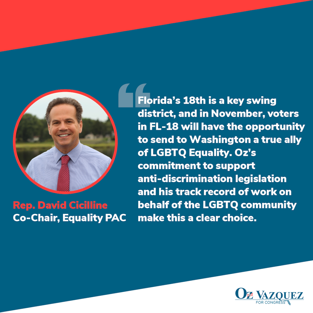

INCREASING AUDIENCE ENGAGEMENT THROUGH DIGITAL OUTREAChOn social channels, we created graphics for everything from endorsements to holidays to thank-yous and virtual town halls during the COVID-19 crisis. We ultimately wanted to emphasize Oz’s support amongst Democratic leaders and his commitment to his community.


