Brand
New Horizons
Our logo for Laurie Bishop was inspired by Montana’s famed mountain peaks. From the slant of the ‘A’ to the repurposed ‘O,’ we opted for lines and angles that echo the state’s unparalleled landscapes. The blend of retro typeface and contemporary color palette create a logo that honors tradition while looking to new horizons.
Tradition Meets Modernity
We chose the serif fonts Bodoni Moda (headers), Shippori Mincho (body), and Barlow (buttons and accents) to capture Laurie’s articulate and elegant demeanor while conveying modernity, strength, and courage.

Inspired By Nature
The color palette was inspired by Montana’s beautiful natural landscape. Plum and Fuchsia are based on the vivid shades of Montana’s state flower lewisia rediviva, in addition to being Laurie’s favorite colors.
Named after women’s rights activist and leader of Montana’s suffrage movement, Jeannette Rankin, Jean is a soft, dark, cornflower blue that conveys perseverance in a more traditional Democrat hue.
To balance the darker shades, River represents the picturesque waterways and lakes of Montana. Mist is cool and relaxing — inspired by morning mountain fog.

The high contrast color palette allows for versatility on both web and print.


Lead Designer: Kim BariringA Flair for Comedy
When it came to former comedian Eddie Geller’s brand, we were inspired by vintage comedy album artwork, retro political posters, cinema, and modern, bold type treatments. We wanted to create voice-driven typography that embodies Eddie’s wit.
Closely set bold lettering in the logo conveys friendliness and verve, while slightly flared characters capture the rhythm and charm of the human hand.

Talkative Type
For type, we paired the bold display typeface Kanit for headings and buttons with Aktiv Grotesk Extended for body text. Kanit is a humanist typeface with the curves of more modern, geometric typefaces. It echoes the bold typography seen in vintage Kennedy posters. With its extended letterforms and squat ascenders and descenders, Aktiv Grotesk adds character and charm.
We wanted a variety of typefaces that could each take on a different voice and work in tandem to deliver both Eddie’s jokes and earnest hopes for our country’s future.

A Palette to Balance
Inspired by vintage political collateral from the late 50s and early 60s, this retro patriotic palette includes a cyan to inject electricity. We kept to more traditional patriotic colors to ground the funkier typographic choices and voice-y content.


Lead Designer: Emily Monjaraz
Developing Design
Although we didn’t design his initial logo, we began developing Oz Vazquez’s candidate website by pulling the red and teal from his logo and adding tints. This expanded palette gave us a balanced set of pastels and saturated colors that better evoked the Americana beach town vibe of the St. Lucie region.

Type With Roots
Next we searched for a bold display typeface that would distinguish Oz’s brand from other Democratic campaigns and speak to both his multicultural upbringing and roots as a Floridian. Paying homage to the rich history of hand lettering in Latin design, we ultimately chose a typeface with distinctive rounded ‘A’ characters, a particular feature of hand lettering in 1960s Cuban political protest posters. We paired this with Nunito Sans, which we reserved for cases of longer blocks of text.

Website Overhaul
In designing a new website for Oz, we wanted to prioritize creating clear actions for signups and online donations, while developing a site that was clean, mobile-friendly, and flexible enough for the campaign to update.

Brand Applications
We extended the new branding to social, where we created graphics for everything from endorsements to holidays to thank-yous and virtual town halls during the COVID-19 crisis. Whether it was through Americana textures or Florida-specific details like orange blossoms, we ultimately wanted to ground Oz’s campaign brand in a sense of place and emphasize his commitment to his community.


Lead Designer: Emily Monjaraz
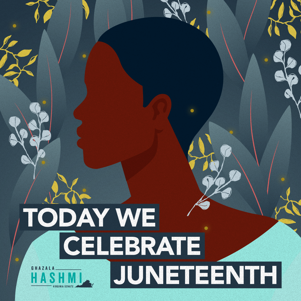
Brands With Reach
Even when we don’t design a client’s initial brand, it’s important to our team that we evolve and infuse a strong visual identity through every facet of design we touch.
In the case of Virginia State Senator Ghazala Hashmi, we worked to develop an illustration style that was flexible enough to apply to a variety of holiday and event graphics on social, and that ultimately enriched her outreach and communications with constituents.


Lead Designer: KIM BARIRING